The Toronto Transit Commission’s recent market testing of new signage for its subway entrances is a pleasant reminder of what the T.T.C. is capable of. Though it’s easy to view the city’s transit system as the mishmash of multi-generational utilitarian signs and handwritten notes it has become, interesting design has long been a T.T.C. hallmark, from the Bloor–Danforth line’s touted system of colour-coded platforms to Paul Arthur’s well-meaning but ill-fated wayfinding system, at St. George station.
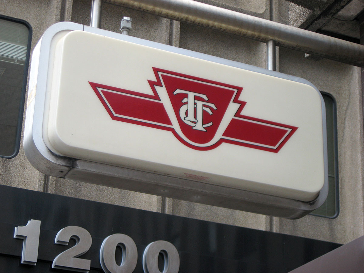
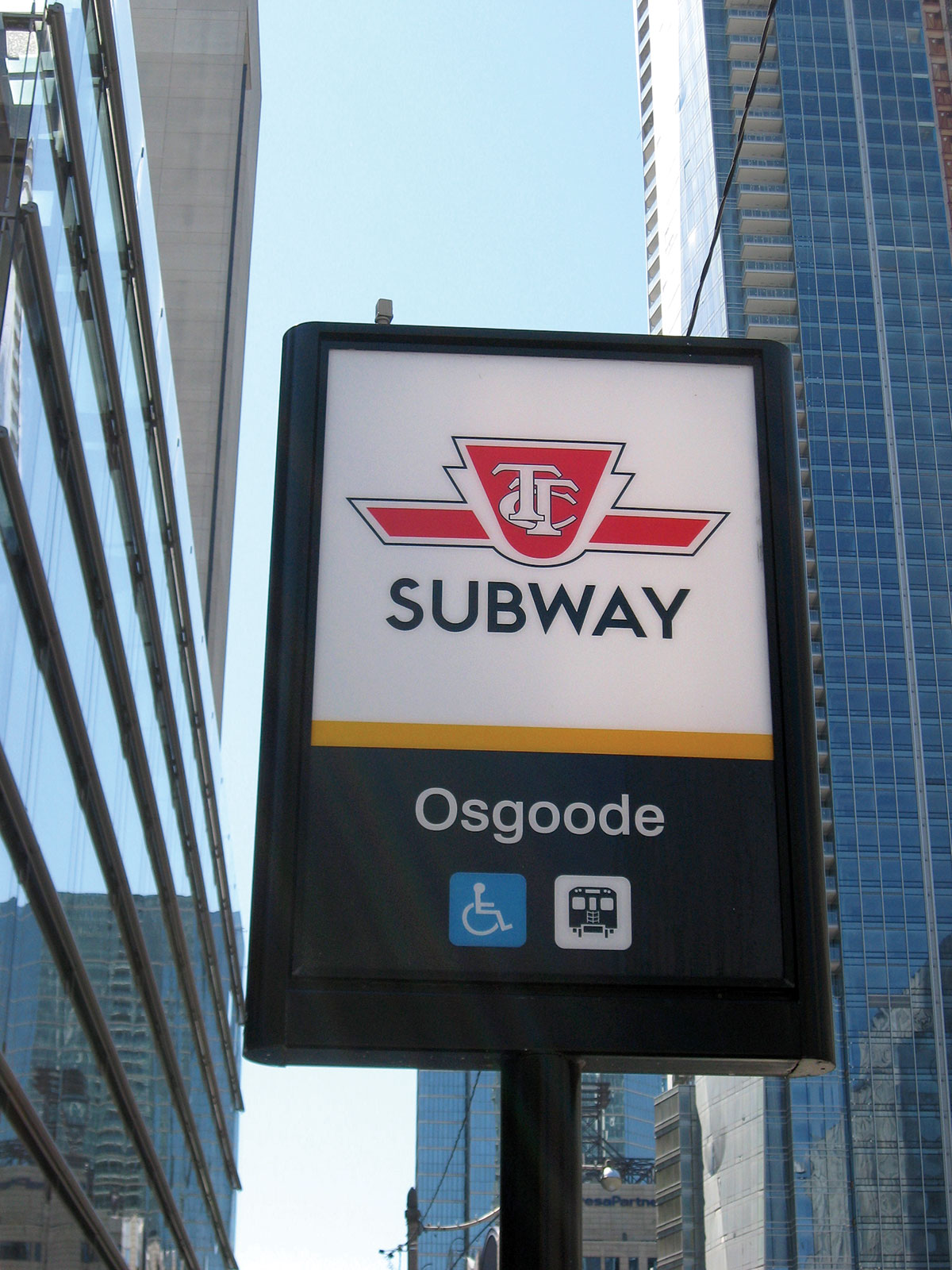
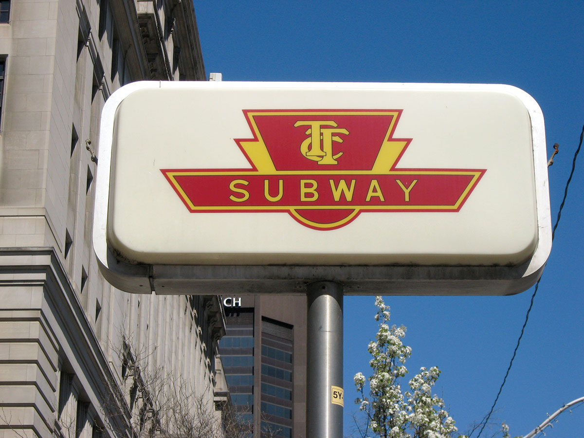
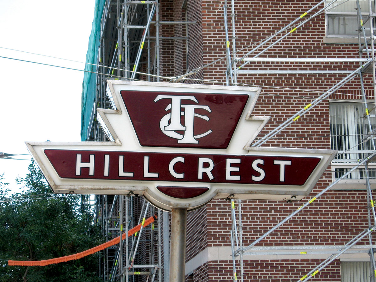
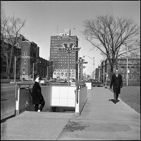
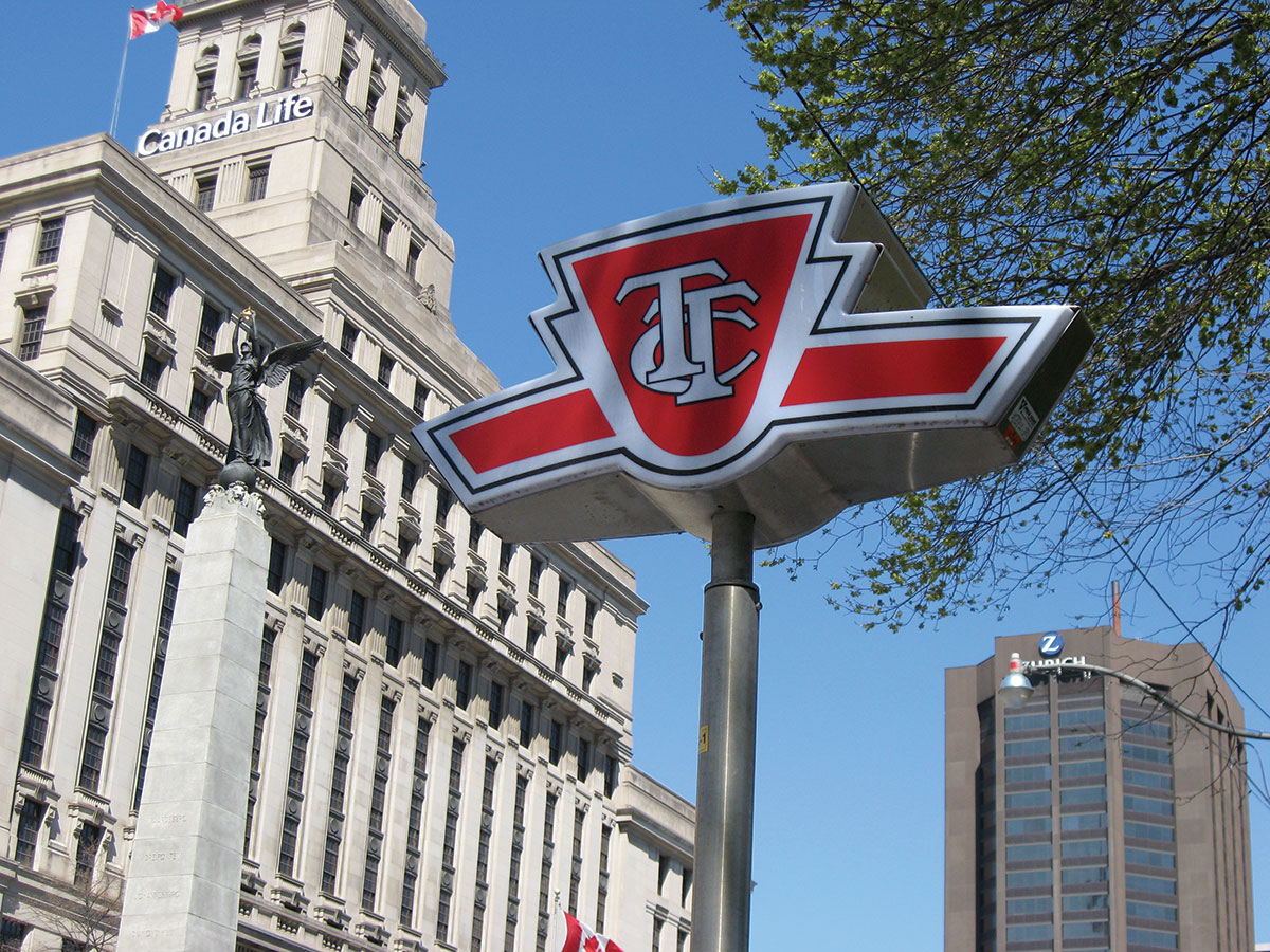
The lone new sign is being tested at the northeast entrance to Osgoode, a spot chosen for the various generations of signs that mark the station’s other three entrances around the intersection of Queen and University. The totem pays tribute to the subway entrance markers of the mid–twentieth century, constructed in the shape of the T.T.C.’s winged keystone crest. (Very few of the original signs remain; those that do are found mainly outside T.T.C. administration buildings and facilities.) Unfortunately, without the original signs’ addition of the word “subway,” in the crest’s wings, the new signs, so far, have proven to be too much form over function.
“One of the things we learned was that [the sign] probably isn’t clear enough to stand on its own so that people know it’s the subway,” Chris Upfold, the T.T.C.’s chief customer officer, said recently. “I think what we were trying to do is replicate some of the stuff the London Underground logo does. The difference is, obviously, the London Underground logo has the word ‘UNDERGROUND’ in it.”
The T.T.C. plans to continue testing versions of the totems, though budget cuts and city council infighting likely will prevent a rollout of new signage anytime soon. But it’s nice to see design hasn’t fallen off the priority list completely.
